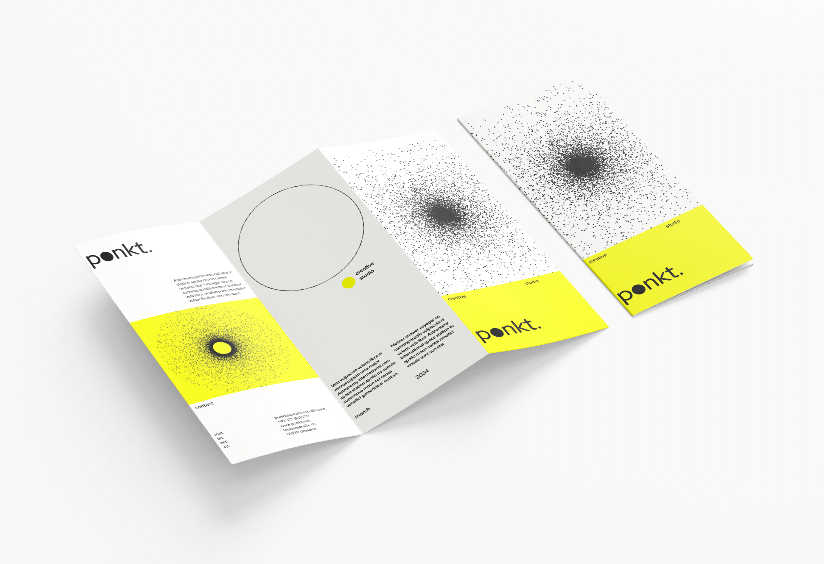
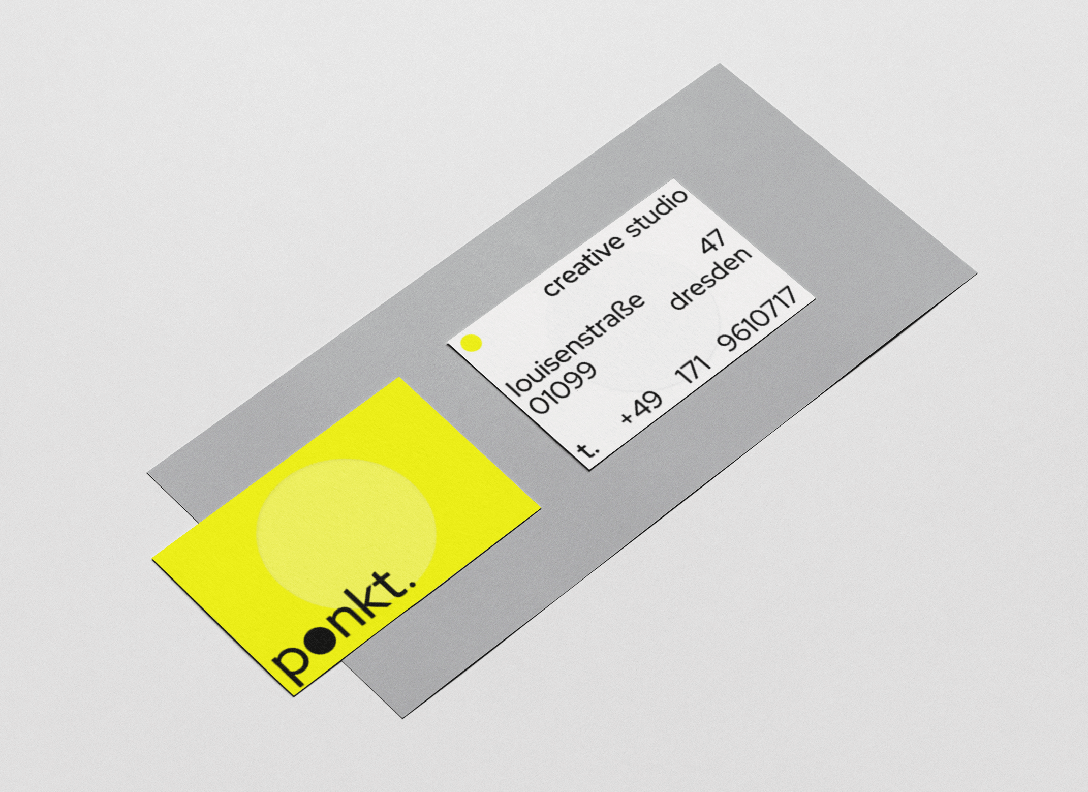
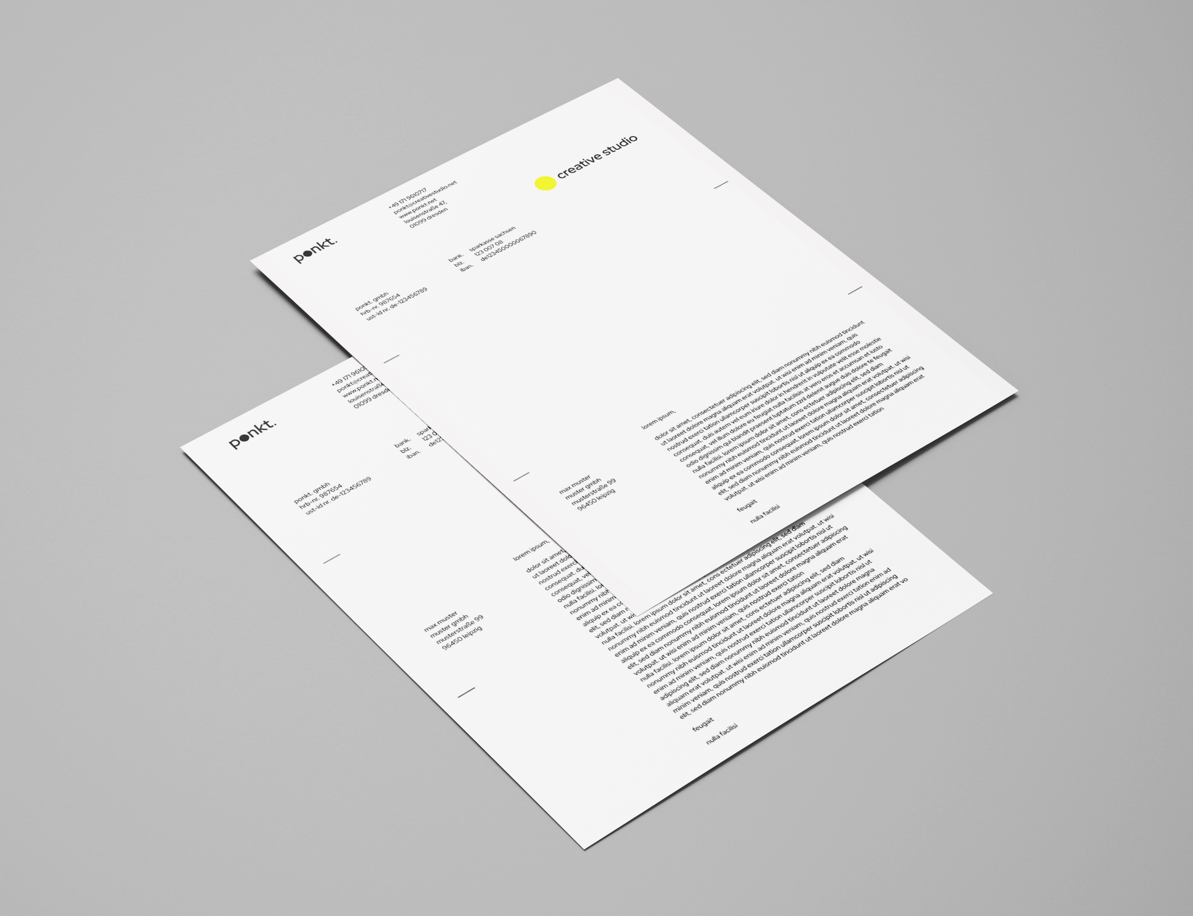
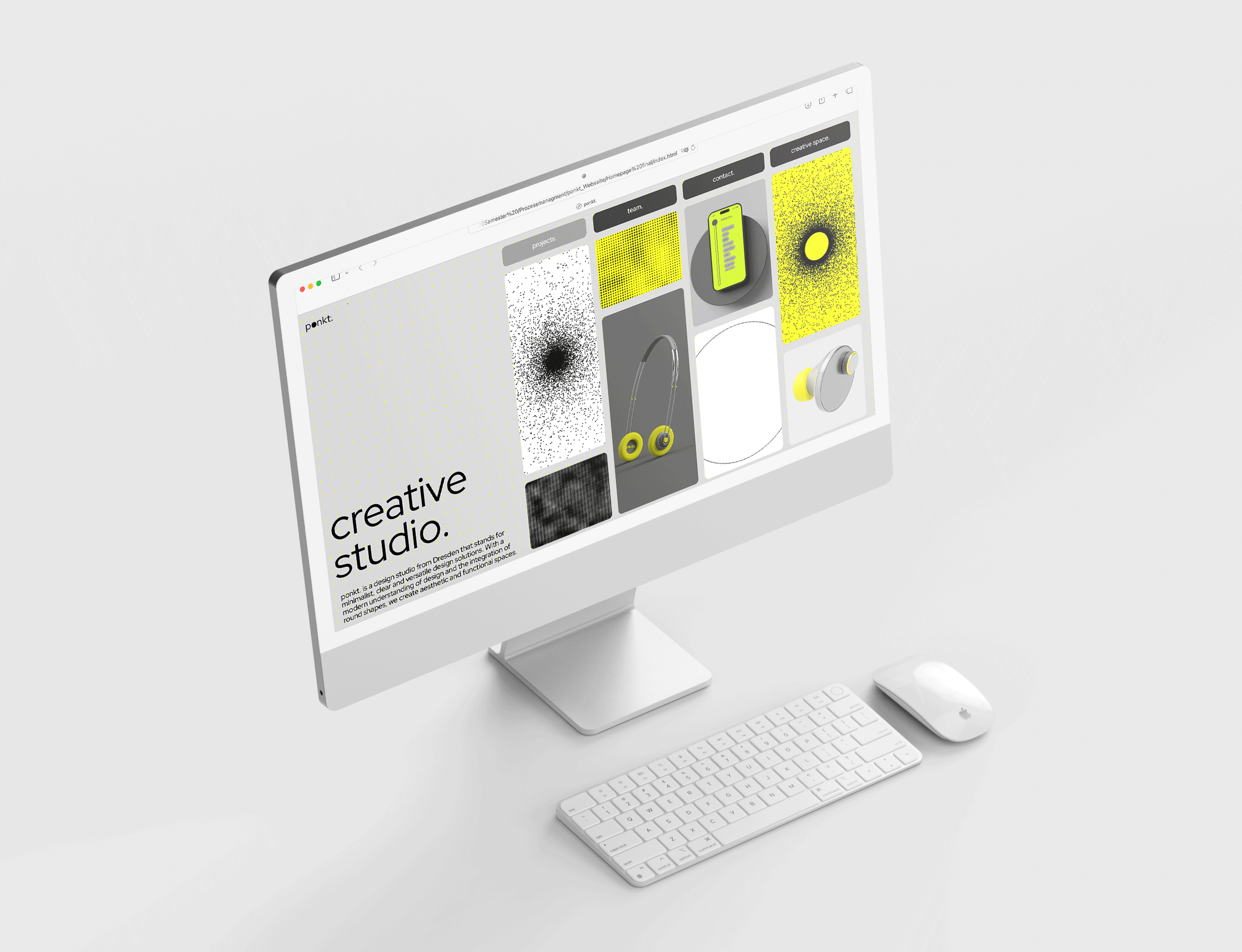
These drafts show the design and realization of the corporate design of the fictitious design office “ponkt.” The design includes the word or figurative mark, business card, information flyer, letterhead with folder and the landing page of the website (self coded).
“ponkt.” stands for clarity, minimalism, unconventionality, functionality, versatility, youth and overall ROUND. The concepts were laid out in such a way that they are round in themselves and represent the togetherness and the key identity, with the yellow dot always stretching through all the designs.
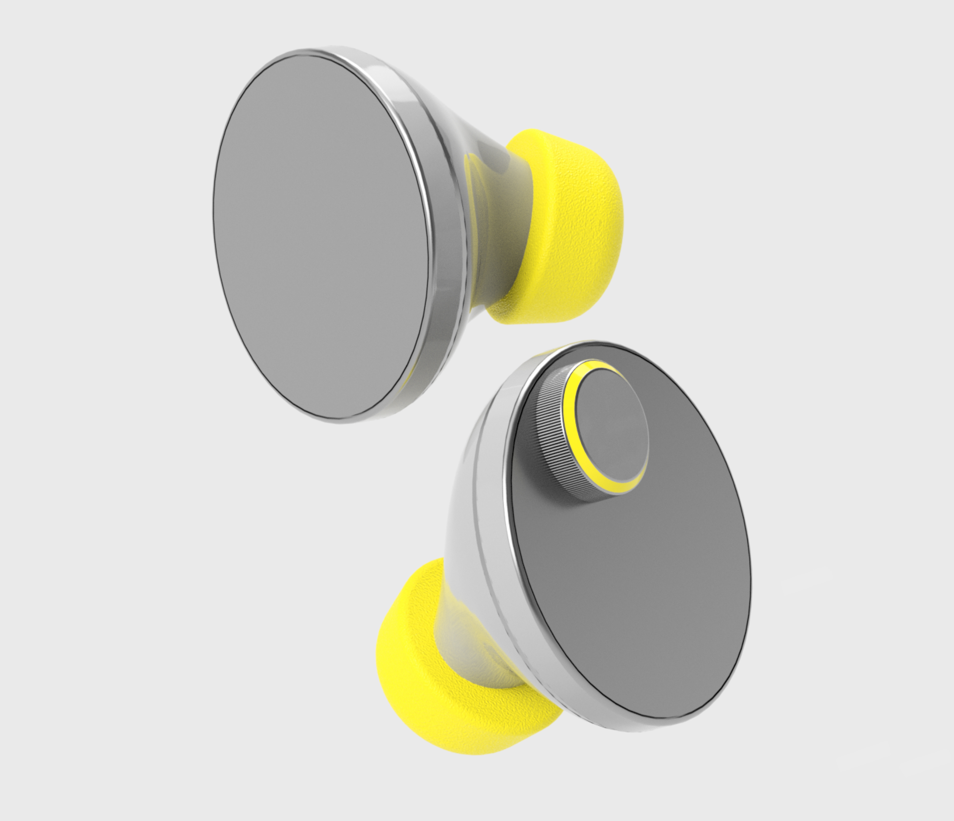
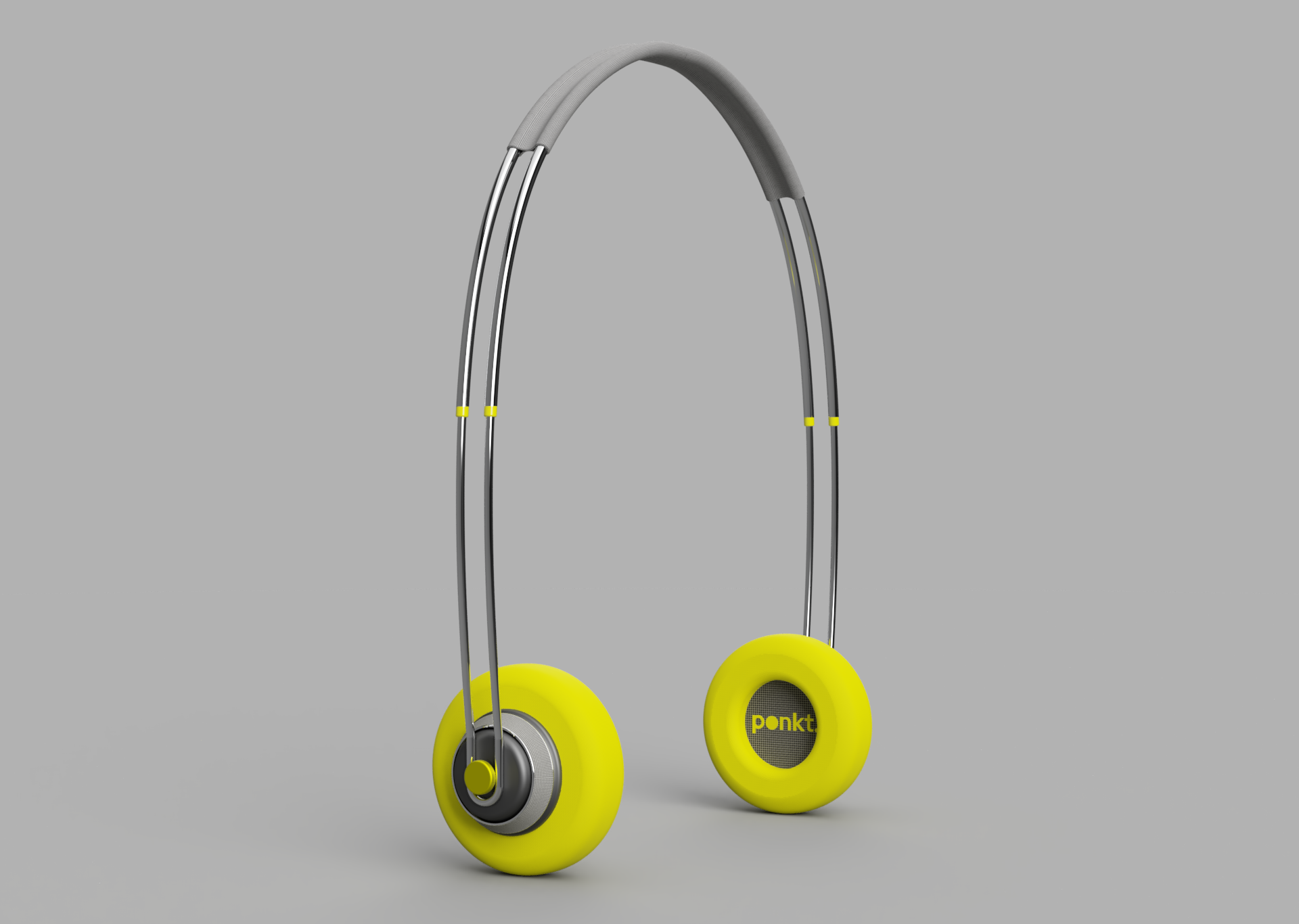
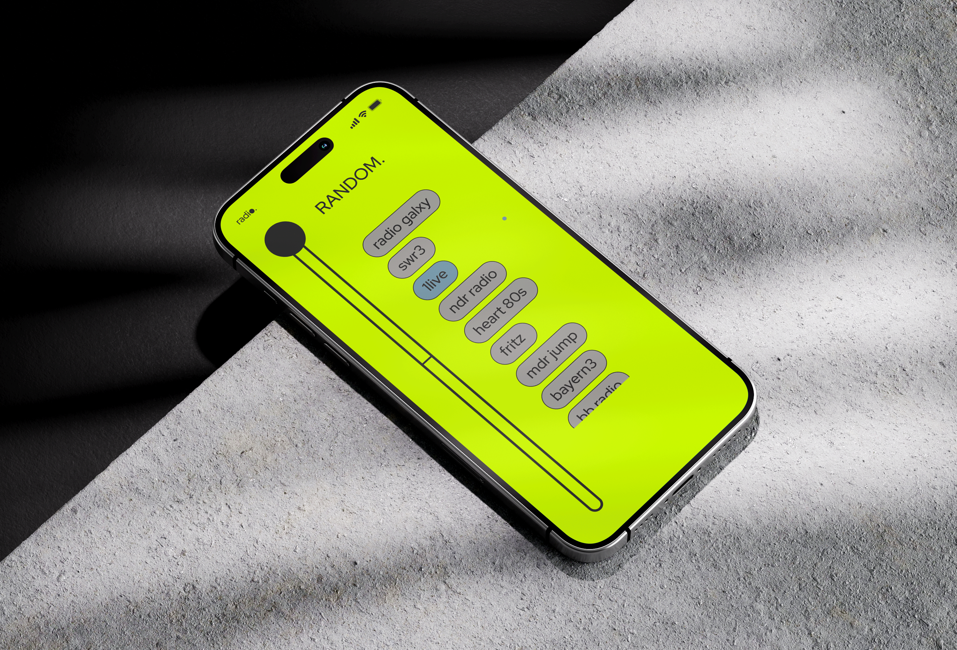
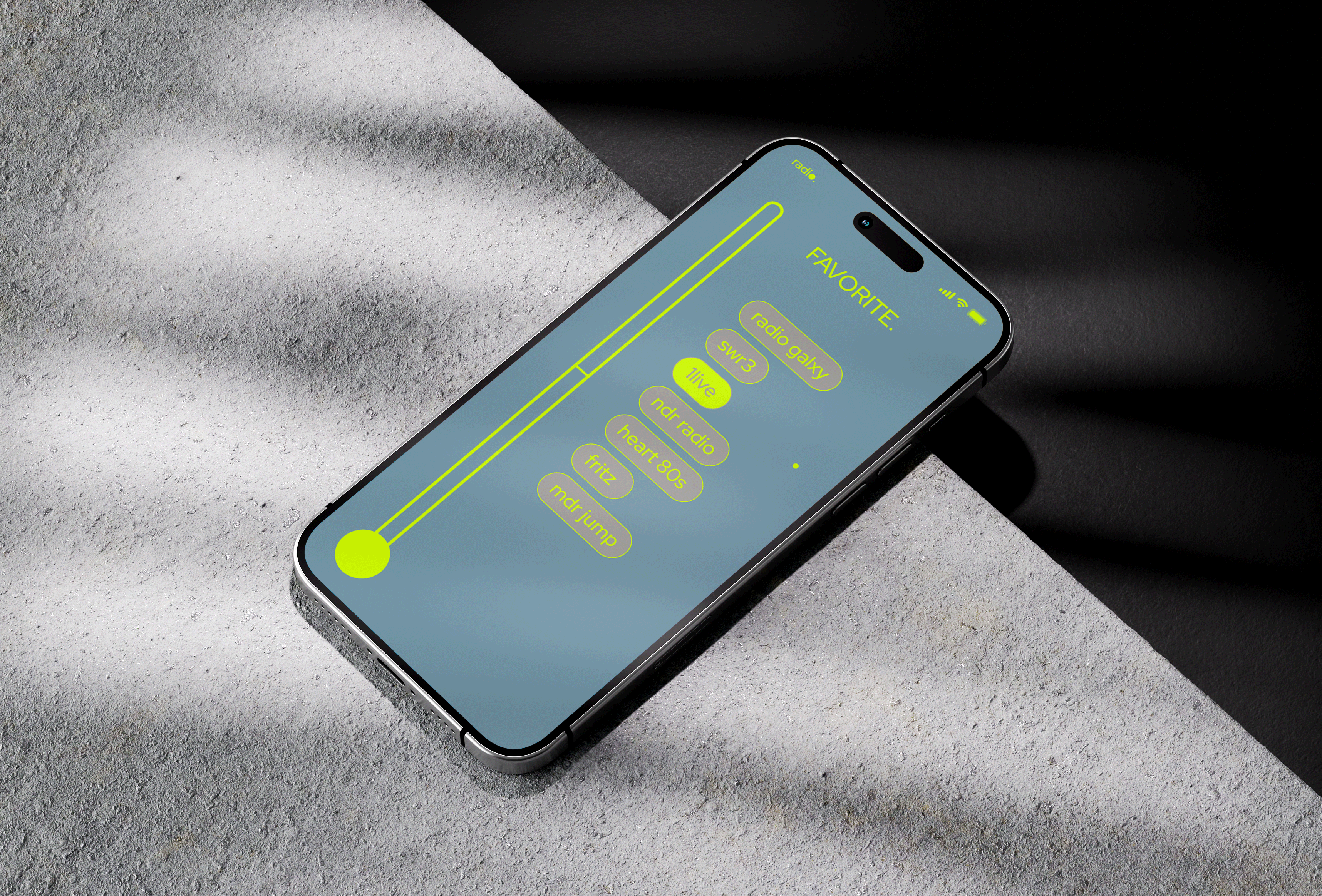
In the further course of the project, the design ideas of the fictitious office were translated into two product concepts. The "in-ear dots" and "on-ear spots". The two headphones and mobile head radios can be operated via a separate app. The visualisations can be seen here on the ponkt.-website.
